Why the "Easy Path to the Face" Principle Emerged
In the classical tradition of elegance—typically associated with tailoring culture and the etiquette of appearance—there exists a position: the gaze of someone speaking with you should arrive at your face effortlessly and remain there. It should not get stuck on the body, fall toward the lower part of the frame, or fixate on a loud detail.
Important: this is not a universal law of composition. In art and photography, it is entirely normal to construct an image around multiple points of attraction: eyes + color accent + inscription or symbol. Moreover, this can be quite beautiful and intellectually engaging—when the viewer traverses a path through semantic nodes. But this is a different genre: there, the image deliberately distributes attention among various messages, and the person partially becomes a vehicle for composition or idea. An unobstructed gaze toward the face belongs to the genre of live, socially courteous contact.
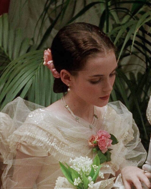
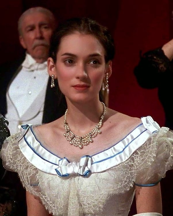
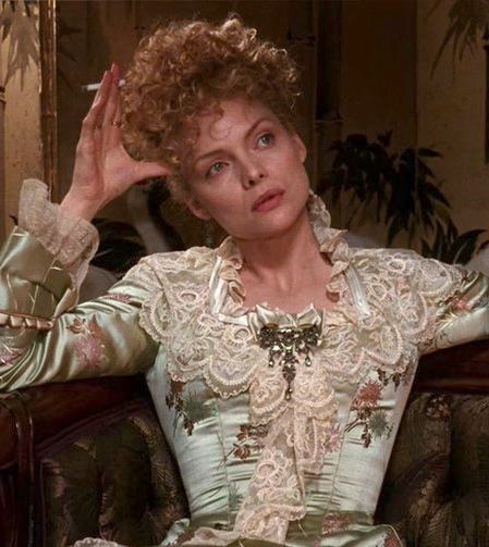
In Martin Scorsese's film "The Age of Innocence," the costumes excellently demonstrate a technique that works precisely on attention hierarchy: the face becomes the primary center, while everything below helps return the gaze to it.
Evening gowns of that era are typically constructed so that the décolletage line and the exposed strip of skin at the base of the neck become an exquisite frame, while the luxurious fabrics on the bodice are arranged not as an independent attraction, but as scenography for the face. Hair is gathered and styled to support the silhouette of the head without fragmenting attention with unnecessary sharp details. The jewelry often plays the role of an intermediate fixation point at the base of the neck: it holds the gaze for a moment and directs it upward, toward the face and eyes, preventing attention from falling lower into the body zone.
This technique is perceived as the fulfillment of elegant etiquette: it reduces the burden on the interlocutor and supports a contact where the person is read first, not the individual details of their appearance.
Why This Works Specifically in Communication
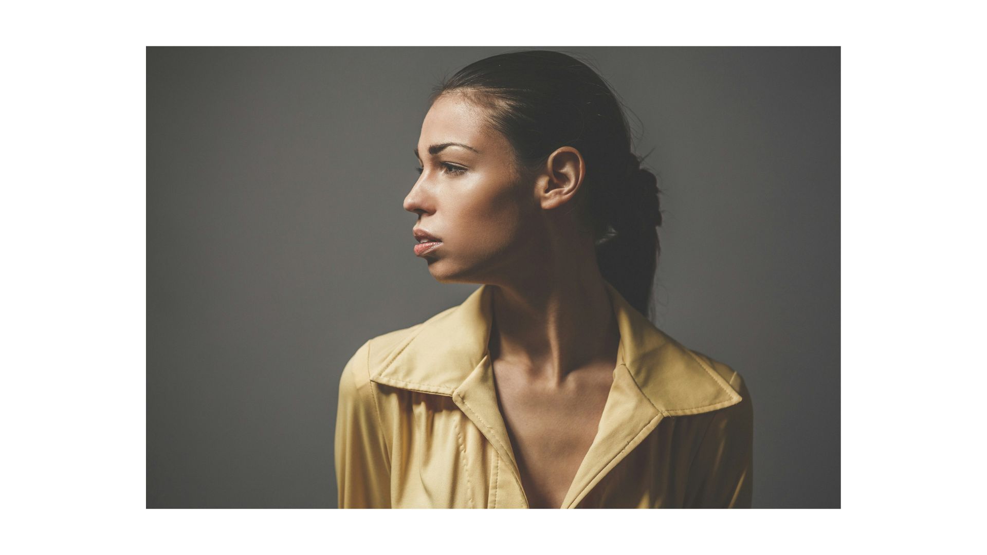
Visual weight is not a metaphor but a practical reality of perception: in any scene, there are elements that the brain highlights first and that draw attention. For humans, such highly attractive objects are almost always key parts of the face—especially the eyes and mouth. This is because we most quickly read intention, emotion, and the possible reaction of our interlocutor from the face.
But low-level salience (contrast, color, brightness) can also capture attention. Therefore, in practice, the face does not always win—it wins when you do not create competitors at the level of salience.
What Does Science Say?
Neuroscience asserts that face processing relies on specialized cortical regions, often described as the fusiform face area (FFA).
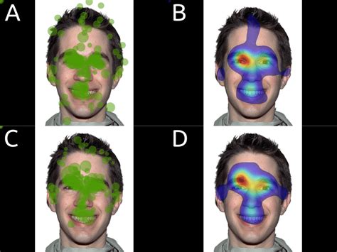
The next group of strong magnets comprises the body and body parts, primarily the hands. The extrastriate body area (EBA) has been described, which responds to images of bodies and body parts; hands are among such stimuli in experiments.
Parallel to this, low-level attraction factors also operate: brightness, contrast, saturated color, sharp detailing, and prominent form boundaries. Models of visual attention describe this through a saliency map: what stands out more strongly against its surroundings more often receives priority and becomes the target of the next gaze fixation.
Text stands apart. Even if the writing on clothing is not read for meaning, the letter-symbol structure itself is a powerful stimulus: reading relies on stable neural specialization associated with the visual word form area (VWFA). Therefore, a line of text, a logo, or a slogan often becomes an independent focus and competes with the face for the right to be primary.

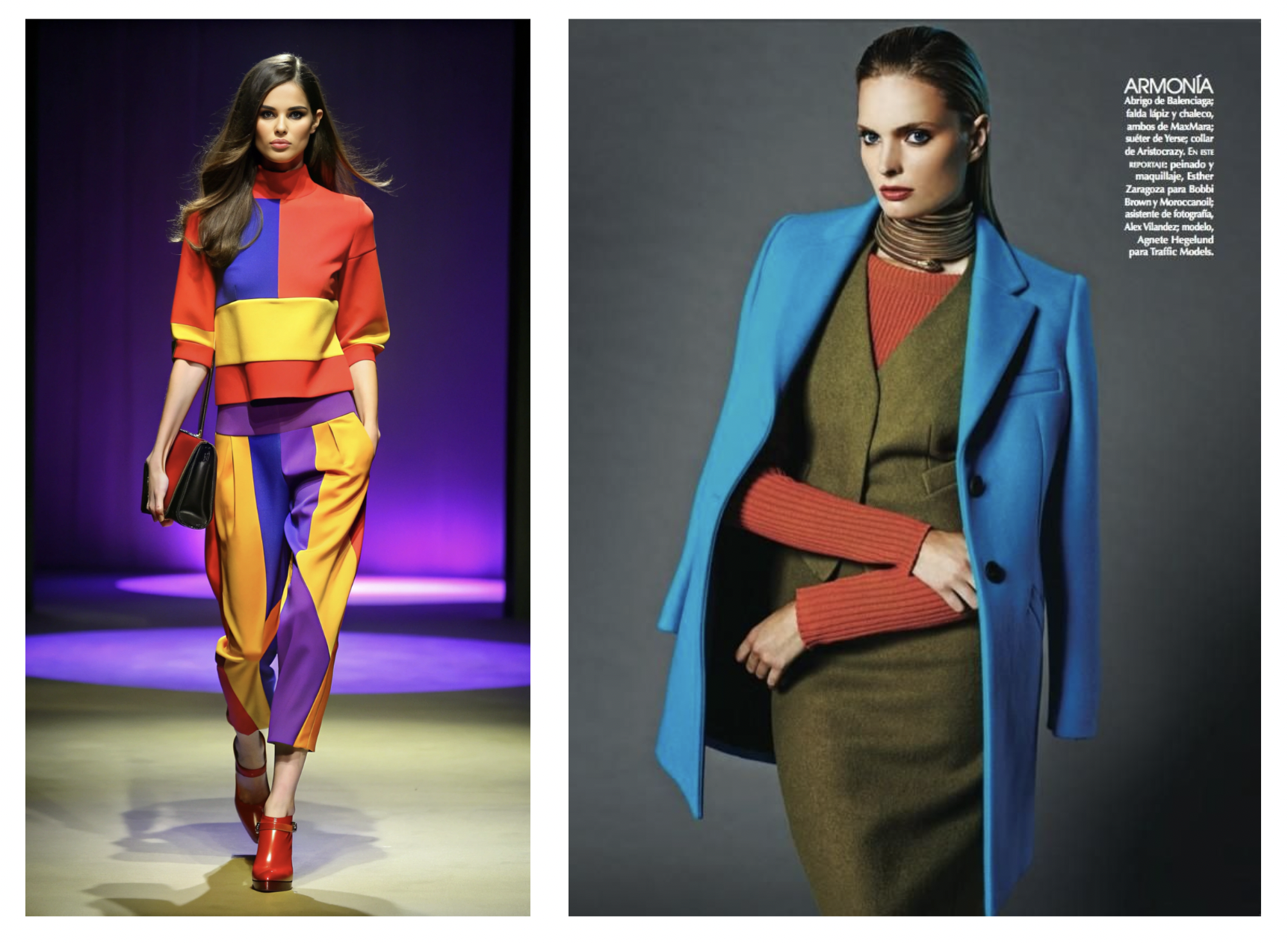
Logos and Inscriptions as a Way to Divert Attention from the Face
A logo on the chest, large text on a t-shirt, a monogram in a repeating pattern—these are built-in commands for the gaze to stop and recognize a sign. This pause often occurs automatically because the visual system is trained to identify letter forms and string structures, and a literate person has specialized mechanisms for processing letter strings.
As a result, the interlocutor first reads the clothing, then returns attention to the face—and this return requires extra effort. Sometimes this is the goal: to make the look about a message, about belonging, about provocation. But if the goal is conversation, trust, and clarity, inscriptions become that very obstacle.
The Psychological Angle: Etiquette as Burden Reduction
What matters here is not only where the gaze falls, but what happens to the interlocutor's internal state. When there are strong competitors to the face in an appearance, the person must constantly engage volitional attention control: noticed something, got stuck, returned the gaze to where it is socially appropriate. This is small but repetitive cognitive work. And the more often it occurs, the higher the background tension and the less resource remains for the conversation itself.
Therefore, the principle of an easy path to the face can be understood as courtesy expressed through visual hierarchy. This is not a prohibition on expressiveness. It is a way to remove friction and make contact smoother.
The Psychological Angle: Anxiety and Defense
There is also a reverse side. Attention-capturers sometimes serve a protective function. When a person feels anxious about being seen, it is easier to shift the center of attention from the face zone to the zone of things: into text, brand, bright spot, emphasized detail. Then communication becomes less vulnerable because the interlocutor spends more time interacting not with the face, but with the image-object.
The elegant tradition, conversely, presupposes the capacity to sustain the primary focus on the face. Not because it is correct, but because it supports trust and clarity.
The Psychological Angle: Archetypes as Role and as Personality
If we view this archetypally, we can distinguish two ways of reading a person.
The first is through personality. When the face is the primary center, the archetypal tone is read through expression, gaze, facial movement, and living presence. In this mode, even status-laden or formal themes are perceived as human: strength without pressure, intellect without demonstrativeness, dignity without performance.
The second is through role. When the primary element becomes a sign, a message, a demonstrative accent, the archetype is read as mask and manifesto. This can be appropriate: for a creative statement, for the energy of rebellion, for play or show. But it changes the relationship with the interlocutor: first the role, then the person.
This is precisely why the principle of an unobstructed path to the face is linked with refinement and elegance: it supports reading personality rather than role, and reduces unnecessary burden on the one who is looking at you.
What This Looks Like in Practice: Common Obstacles and What to Replace Them With
Large Text or Logo on the Chest
Effect: the viewer reads you before meeting your gaze.
Replacement: clean texture without letters, a small mark without contrast, or a meaningful accent closer to the face—for example, an expressive collar line instead of an inscription.
Strong Contrast Below the Face
Effect: the gaze falls downward because salience is higher there.
Replacement: raise the contrast closer to the face or distribute it more softly along the vertical.
Provocative or Hyper-Detailed Zone on the Chest or Décolletage Area
In the plot of Martin Scorsese's "The Age of Innocence," Michelle Pfeiffer's character observes all proprieties yet still seeks love—her properly modest décolletage is nevertheless lavishly decorated to draw attention to the heart zone.
Effect: the interlocutor must manage their own gaze to return to the face, and this creates tension.
Replacement: if sensuality is needed, achieve it through fabric quality and fit rather than through a clamoring fixation point.
Hands as a Competitor to the Face
Effect: large hands in a bright spot or in sharp focus become the primary stop.
Replacement: either the hands work toward the face, or they recede into a quieter zone in terms of light and detail.
Conclusion: This Is a Choice of Role, Not Correctness
If you want an appearance-as-dialogue, elegance as respect and clarity—ensure the strongest magnet is in the face, while everything else either supports it or gently leads toward it. If you want an appearance-as-object, an appearance-as-manifesto, an artistic composition—allow multiple equal foci, but then you are consciously changing the scenario of contact.